
This activity encourages you to explore the nature of negative space to visually nterpret a subject. Choose 3 from the following subjects:
- clouds • Moby Dick • sugar • polar bear • ice cream cone
- whipped cream • Jaws • ghost • smoke • kangaroo
The subjects themselves should not be drawn, only the surrounding negative space and use black ONLY.
Draw 2 thumbnail sketches for each subject then select the most effective solution for each and re-draw in the larger box.


Analysis:
The concept of drawing an image by only addressing its background changes our natural approach to seeing. When we are led to focus only on the background the unmarked portion of the page (the white ground) becomes transformed into a recognizable subject. Our traditional image making process is thereby reversed, with a greater emphasis on composition, positive-negative relationships and framal reference (i.e. the "box"). The use of negative space in a design often results in greater "retention"; where the viewer retains the mental image of the design for a long time. There may be other influences at work here of course, like intriguing copywriting, the nature of the image etc.
Part B:
Find 4 examples where whitespace has been used effectively in -
- Print-publishing (magazine/newspapers) 3. A website
- Street advertising (billboards/shop-frontage 4. My choice

2. Dee Why RSL Club, located 10 minutes from my house. This clever design incorporates the words Dee Why with its signage of a letter D and a letter Y.


3. This website uses clever whitespace, and no doubt, as it is for an advertising company. http://www.twocreate.co.uk/

4. My choice
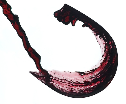
I saw an advertisement some time ago and managed to track down the image in Google Images (http://moscowcoffeereview.com/carpecakem/wp-content/uploads/invisible-wine-glass.jpg). I think its use of white space gives off an amazing effect.

• another cute little logo which uses whitespace
No comments:
Post a Comment