
1. Your client whose Brisbane-based business is supplying OH&S resources (books, clothing, measuring equipment etc.) to Mining / Civil & Mechanical engineering fields needs a new business identity/ brand. You need to suggest a new colour scheme for their business.

2. Your client whose business is producing rugged outdoor footwear for the domestic (Australian) market has developed a new range for teenage girls. What could you suggest would be the colour scheme for this new brand? Fill the swatches below with
your choices. Explain why you chose these colours.

Most outdoors footwear use the colour brown. In order to keep with this fashion I would incorporate a brown/tan colour in my colour scheme. I would also add a splash off colour to look more appealing to young teenagers.
3. A client who represents an Australian Govt. agency to support drug rehabilitation services needs a new corporate identity for them. What could you suggest would be the colour scheme for this agency? Fill the swatches below with your choices. Explain why you chose these colours.
3. A client who represents an Australian Govt. agency to support drug rehabilitation services needs a new corporate identity for them. What could you suggest would be the colour scheme for this agency? Fill the swatches below with your choices. Explain why you chose these colours.

Based on the “Life Matters” interview with Anjel O’Bryant, ‘The Power of Colour’, Creative Rehabilitation colours are: pale blue, pale pink, and pale aqua.
4. How many colours can be represented by the Pantone CMYK process for print?
Most of the Pantone system's 1,114 spot colours cannot be simulated with CMYK but with 13 base pigments (14 including black) mixed in specified amounts. “The number of unique colours has now grown from 1,114 in the current base PMS books to 2,058 in Pantone Goe. More colours were added in the greens and blues, and the total colour gamut has increased” (Gable, 2007).
5. List 3 free-to-use online software tools to help you develop colour schemes. List their URLs and describe the one you like best and why you like it.
• Colour Scheme Designer 3 http://colorschemedesigner.com/
• Colour Lovers http://www.colourlovers.com/create
• Instant Colour Schemes http://www.gpeters.com/color/color-schemes.php
Colour Scheme Designer 3 is the one I like best. It is extremely user friendly and allows you to choose from mono, complement, triad, tetrad, analogic or accented analogic.
Colour Lovers is free, but you will need to register if you want to save your created palettes.
Instant colour schemes are a close 2nd. I particularly love how easy it is to find colour schemes to match eras from within this site.
* A useful link that provides many more colour scheme tools http://designshack.net/articles/inspiration/25-awesome-tools-for-choosing-a-website-color-scheme/
6. Colour Models; describe in your own words the four computer-graphics colour models hint: RGB is one model. Just a few important details on each are fine.
RYB: Red, yellow, and blue (RYB) are the primary colours, which became the foundation of colour theories. It describes how artists mixed paint pigments to produce colours. The RYB Colour Model is a subtractive system. A mixture of two primary colours is darker than the original colours. A mixture of all three primary colours should approximate black, although this is usually not precisely true.
CMYK: Cyan, magenta, and yellow are the secondary colours on the RGB colour wheel. Black is used in addition to CMY for these reasons:
• Black ink is cheaper than mixing C, M, and Y to obtain black.
• Text printed in black has fine detail that would be blurred if printed with three different colours.
• A mixture of C, M, and Y produces an imperfect shade of black.
RGB: The RGB Colour Model is an additive system. The RGB model is the basis for displaying colours in television and computer screens. Each pixel of the screen is recorded as the triple R, G, and B of numbers. The RGB model is also used for recording colours in digital cameras, including still image and video cameras. In practice, the RGB model must be modified to account for the characteristics of each device.
HSV: Hue, Saturation, Value. When artists began to use computers for graphic design, it was soon discovered that the RGB system is not a very intuitive way to represent colours. “Graphic artists like the HSV colour model because it is an intuitive way to modify the colours in a region of an image. For example:
• Add more green to a region translates to ‘rotate the hue towards 120 degrees.’
• Make the colour more of a pastel colour translates to ‘decrease the saturation.’
• Make the colours in the image darker translates to ‘decrease the value’” (The HVS Colour Model, n.d).
7. According to “Western” perception of colours, describe the emotion associated with the following colours (see table below) and provide an example of its use in contemporary culture.

References
Empower yourself with colour psychology.com, (2014). Cultural Colour. Retrieved from http://www.empower-yourself-with-color-psychology.com/cultural-color.html
Marx, L. (2006). Colour. Symbolism – Western Culture. Retrieved from http://www.lieslmwdesign.com/symbolism/symbol.htm
Empower yourself with colour psychology.com, (2014). Cultural Colour. Retrieved from http://www.empower-yourself-with-color-psychology.com/cultural-color.html
Marx, L. (2006). Colour. Symbolism – Western Culture. Retrieved from http://www.lieslmwdesign.com/symbolism/symbol.htm
Note:
To do the following activity you’ll need to determine the RGB value for a colour using MS Word. You can find this out by using the Shape Fill palette / More fill colours/ Custom (see below):
To do the following activity you’ll need to determine the RGB value for a colour using MS Word. You can find this out by using the Shape Fill palette / More fill colours/ Custom (see below):

8. Demonstrate your understanding of the following colour terms:
a. Hue. Show an example of a “hue” in the swatch below and name it. Indicate its RGB value.
 Aquamarine
RGB: 57, 197, 169
b. Lightness. Make the hue you chose lighter and represent it in this swatch. Indicate its RGB value. Hint: Use the vertical slider in the Colours dialog box to “lighten” a hue.

RGB: 69, 246, 211
c. Saturation. Pick a new hue and in the swatches below represent it at 3 levels of saturation. Indicate the RGB values of each.
Hint: In MS Word, use HSL instead of RGB Colour model to easily change the saturation value, see below left:


d. Define Tint
Tint increases a colour’s lightness by adding white to it.
e. Define Shade
Shade increases a colour’s darkness by adding black to it.
f. Define Tone
Tone changes a colour by adding grey to it, i.e. black and white.
g. Define Gamut
Gamut is the entire range of colour within a given colour space. “For example, while pure red can be expressed in the RGB colour space, it cannot be expressed in the CMYK colour space, pure red is out of gamut in the CMYK colour space” (Wikipedia, 2014).
h. Warm colours. Fill the 3 swatches below with examples.

i. Cool colours. Fill the 3 swatches below with examples

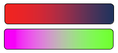
j. Define “Gradient” in the context of colour, in your own words.
The gradient is all the colours in between a colour blend, from one colour point, to another colour point. It is the change in the colours.
e.g
k. Primary colours. Use the swatches below to represent Primary colours:

l. Secondary colours. Use the swatches below to represent Secondary colours:

m. Tertiary colours. Use the swatches below to represent Tertiary colours:

9. Contrast & Harmony
Designers employ colour contrasts, scale contrasts and style contrasts to direct flow, establish focus, and control overall layout hierarchy.
In terms of colour, represent the different types of contrast using the pairs of swatches below:
Contrast of Value

Contrast of Hue

Complementary Contrast

Contrast of Saturation

Cool/ Hot Contrast

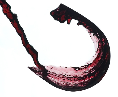
10. Colour Harmony
Find an example of a design that demonstrates a very obvious use of colour harmony (from any website/ broadcast or print media) and paste it below:

References
Gable, G. (2007). CreativePro.com. Accessed April 29, 2014 from http://www.creativepro.com/article/pantone-2-0-after-45-years-the-sequel-to-pms-
The HSV Colour Model, (n.d). Accessed April 29, 2014 from http://condor.depaul.edu/sjost/gph205/paint-pigments/color-spaces.htm
Wikipedia, (2014). Gamut. Accessed April 30, 2104 from http://en.wikipedia.org/wiki/Gamut


